
At the end of last month, the Australian Book Designers Association Awards were presented in a ceremony in Sydney. Text Publishing had four designers on the shortlist and we’re delighted to say that two of them came away winners: Art Director Imogen Stubbs, winner of the Stocksy United Best Designed Young Adult Cover for The Art of Taxidermy, and Designer/Production Coordinator Jess Horrocks, winner of the Penguin Random House Australia Emerging Designer of the Year award.
We asked Imogen and Jess to tell us a little more about the art of cover design, so stand by for invaluable insights into what goes into conceptualising and briefing a book jacket, and the many criteria a good cover needs to fulfil – from not one but two award-winning designers....
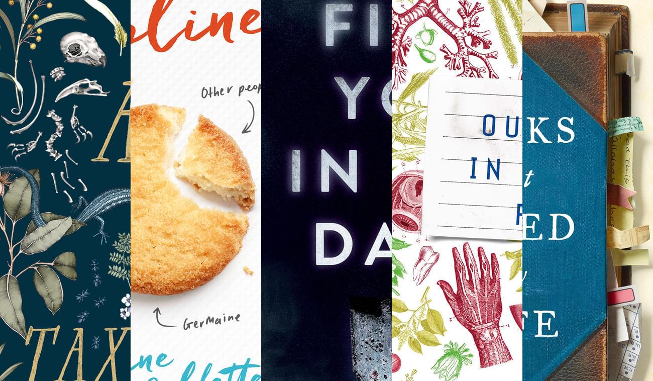
Imogen, congratulations on winning the Best Designed Young Adult Cover award. The Art of Taxidermy is notable for having lovely internal design elements as well as a striking cover, how do you decide which books will contain internal illustrations?

It comes out of a conversation with the editor after I’ve read the manuscript and can see potential for some added elements to accompany the story. It might also come out of a conversation with the wider company – sales and marketing – to do with how we’re positioning the book, the age group we’re targeting, other similar books in the market and whether they include internal illustrations, and if it’s an important consideration to engage these readers.
In the case of The Art of Taxidermy it evolved alongside the cover illustration and internal text design. As this book is a verse novel we realised that there was an opportunity on pages with less text to include some of the imagery from the cover. We were lucky that Edith’s beautiful illustrations are rendered in a style that works equally well in colour as it does in greyscale. The editor and I went through the typeset pages and chose places and imagery that we thought suited the flow without overwhelming the reading experience.
The ABDA website is careful to cite the illustrator, Edith Rewa, as well as yourself as designer, can you tell us how this partnership works? Do you approach the illustrator with a definite design in mind, or do you give the illustrator an idea of the book and a free hand to illustrate it as they see fit?
It changes from project to project but with this particular book I had a clear vision after reading it of what I thought would work and the type of illustration I was after. Thankfully the editor shared my vision and we got the nod from sales, marketing and publicity that this style would meet everyone’s needs. We showed the author, Sharon Kernot, after a couple of rounds of illustrations to make sure she loved it as much as we did and was happy for it to be the cover.
I had followed Edith’s work for many years, so she was the first person I thought of and luckily she was available and interested. She has a beautiful intricate style and a thorough knowledge of Australian flora and fauna. I provided Edith with some sketchy ideas and a brief about what I had in mind but also asked for her input as it’s always a better outcome to allow the illustrator the freedom to surprise you. I like to send the manuscript to the illustrator so that they can get a feel for the story and style, but if they don’t have time to read the whole thing I’ll also send them excerpts pertinent to the cover idea. I also think about the type that needs to go on the cover and how the illustration will work with and around that, and provide notes on colour palettes or possible embellishments we might be using to take into consideration.
How do you think cover design has changed over the last decade or so?
I’m not sure it has changed a great deal; it’s still about communicating ideas and setting a tone. It’s about engaging readers to pick up or click on a book because they want to find out more, while trying to signal the type of book and appealing to its intended audience (better still if it can reach outside of that audience). We talk more about making sure covers work in the online realm as well as in bookstores now, but we’re still always conscious of the book as an object.
In addition to our own local publishing, Text is a very active seller of foreign rights, so we often see many different publishers’ covers for the same book. Have you noticed any trends in how different countries treat covers? How does the Australian approach to covers different from, say, American or British covers? Is there a general cover approach you can identify in any of the overseas territories we sell rights into?
I think some people can still pick a US cover versus a UK cover, but overall the lines and styles are blurred now, likely due to our greater ability to share and access inspiration on the internet and the changing tastes of readers who see the varying covers online. We see trends coming out of all markets that are adopted and trickle down; there have been a few articles about ‘big white type’ covers in recent years, and this was at first an American style but you see it in all markets now. The difference in covers is dictated by what the publishers think their readers want and how best to appeal to them, but there’s also the potential and push for cohesive looks across all markets for greater reach and brand building; it helps to capitalise on publicity and the awareness of a book and author.
And, for another perspective...

Congratulations on winning the the Penguin Random House Australia Emerging Designer of the Year award, Jess! How important do you think awards like this are in terms of building a designer’s reputation?
It’s a hard thing to quantify. When books win awards, we proudly put them on the cover and it often leads to more sales – there’s concrete evidence: more attention, more editions, more reviews. When designers win awards, they include them on their resumes and in their bios and it might lead to more work, more exposure, or maybe just more trust from their existing clients or colleagues. There are plenty of reputable designers out there who have won awards but also plenty who haven’t. I think the important thing is to keep producing, keep creating and keep improving.
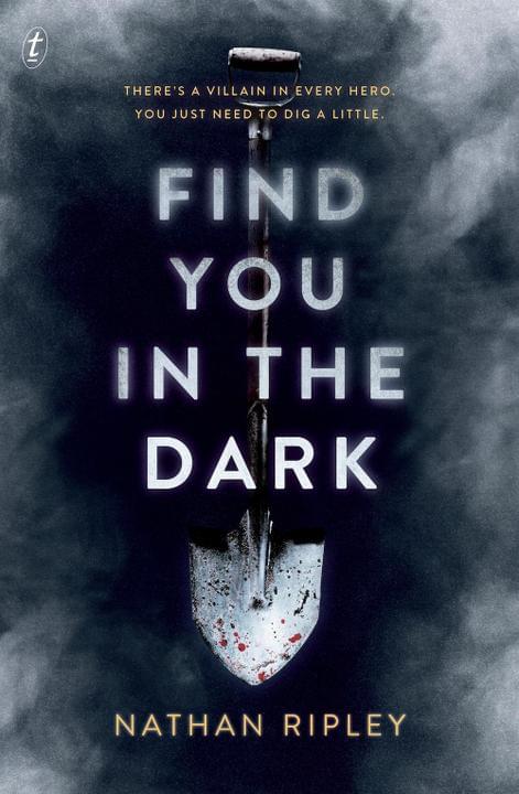
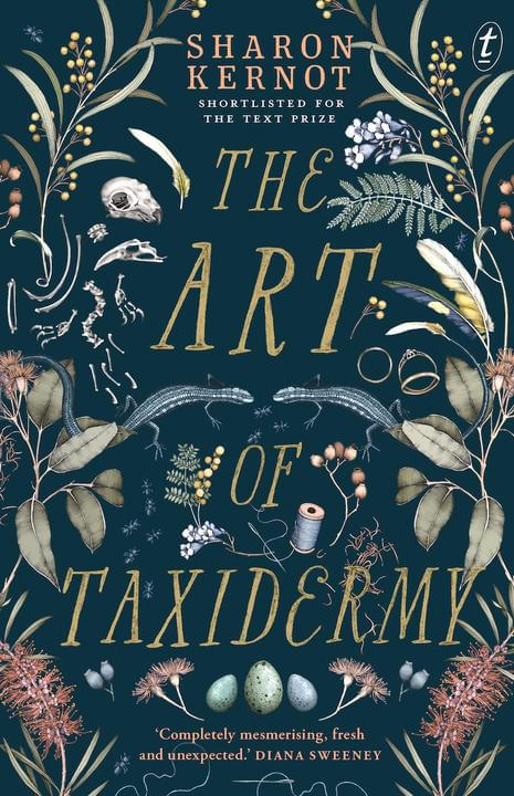
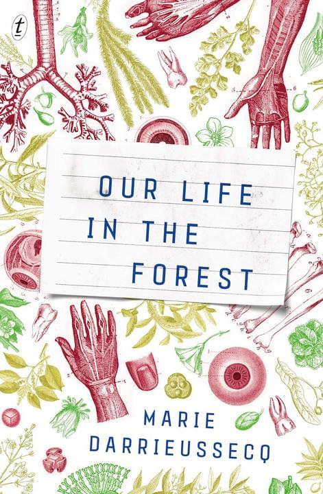
The nomination cited your work on four covers – Books that Saved My Life, Find You in the Dark, The Helpline and Our Life in the Forest. These are all very different books – do you have a tried and tested starting point when you’re handed a cover brief, or do you approach every book cover differently?
No matter how different the books might be, the first step is always the same: read the manuscript. For me this usually happens on my daily commute, which means I actually enjoy train delays rather than resent them (a bonus).
I feel as though I should sketch out ideas while I’m reading but I actually find it more convenient to write lists on my phone. Interpretations, quotes, descriptions of visual ideas. The kind of thing that makes sense to me but is complete gibberish to anyone else.
Once I’ve finished, I’ll often skim over the manuscript a second time to make sure I haven’t missed anything important, which usually leads to a longer list of gibberish. Before getting too excited about a particular idea though, I’ll start doing image or type research to see if it’s actually achievable. Unless an illustrator or photographer is commissioned it often isn’t.
We had talked about commissioning a photographer for The Helpline, for example, but in the end I was able to create a convincing biscuit pie chart by combining three separate stock images. They were from the same shoot, which made it easier given they all had the same lighting, colour and texture. So it does depend.

What are you trying to capture with a cover – is it the content of the book? A particular scene? The general mood of the book? Something else?
It can be all or none of those things – it really depends on the specific book, target audience and market positioning. Genre covers tend to feature visuals literal to the plot, for example, whereas literary covers often have more scope for abstract or mood-based treatments. Non-fiction covers aren’t really meant to signal fiction, unless it’s the kind of non-fiction that blurs those lines.
Mood can be a tricky element to capture because it’s subjective. My interpretation of a book’s mood will be different to someone else’s, as will my visualisation of it. This is why we have briefs!
If a book is overly dark the strategy might be to market it in a way that softens it for consumers, which might not be how I’d have approached it personally.
Overall I’d say I’m generally trying to achieve a balance between capturing the essence of the book and fulfilling the brief’s requirements, which can sometimes be quite different.
Has the rise in importance of online retail and ebooks changed how you approach cover design? If so, how?
Well, I think ebooks have actually had an industry-wide downwards sales trajectory since I started working on covers, or a plateau at least, so the focus has always been more on the design of the printed product for me. Which, yes, can be challenging, given online retail is increasingly important as is the cover’s appeal on social media.
The delicate beauty of a tactile printed cover probably won’t translate online, whereas a cover designed with only screen appeal in mind will probably have the entirely wrong tone in print. For me, it’s just about keeping these two environments in mind and not prioritising one over the other.